Okay, confession time. For years, my digital designs felt… dead. Like, technically they were fine, but they had zero soul. They looked like they were made on a computer, you know? Then I stumbled on a trick that changed everything, and it’s so simple it’s almost silly: using old paper textures.
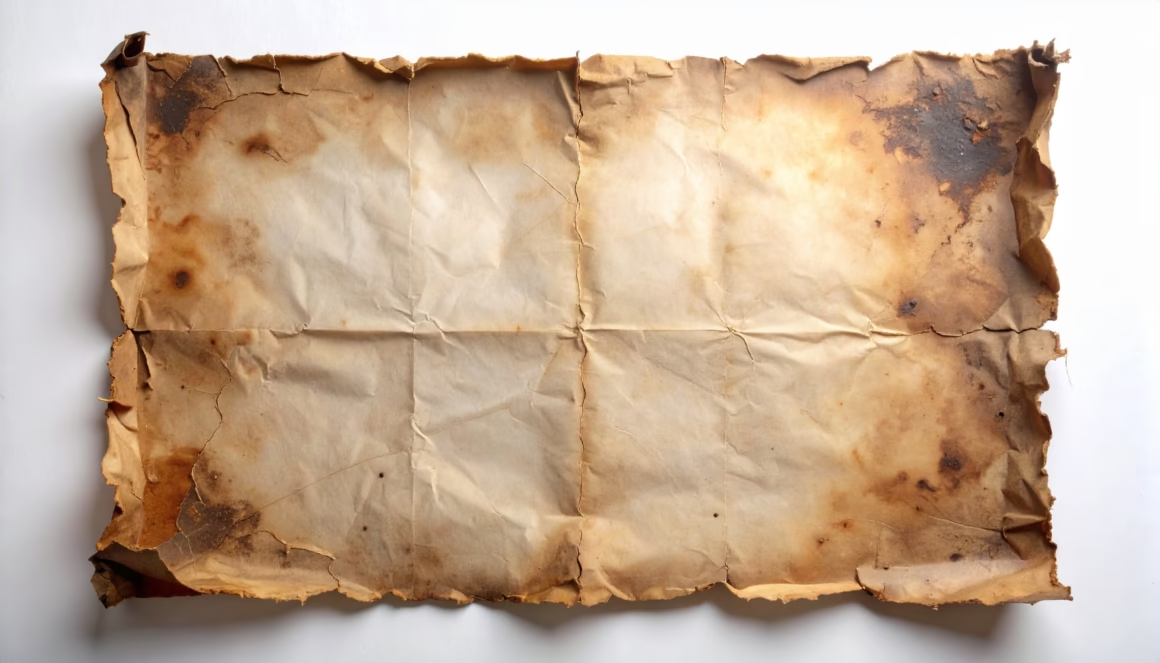
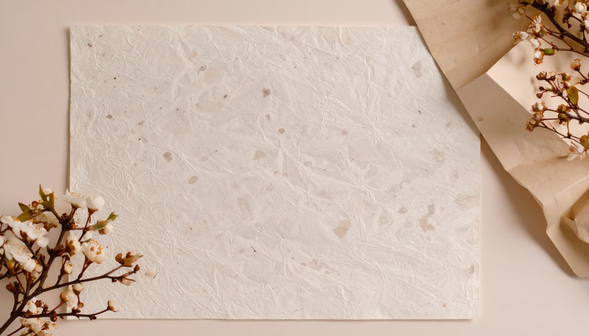
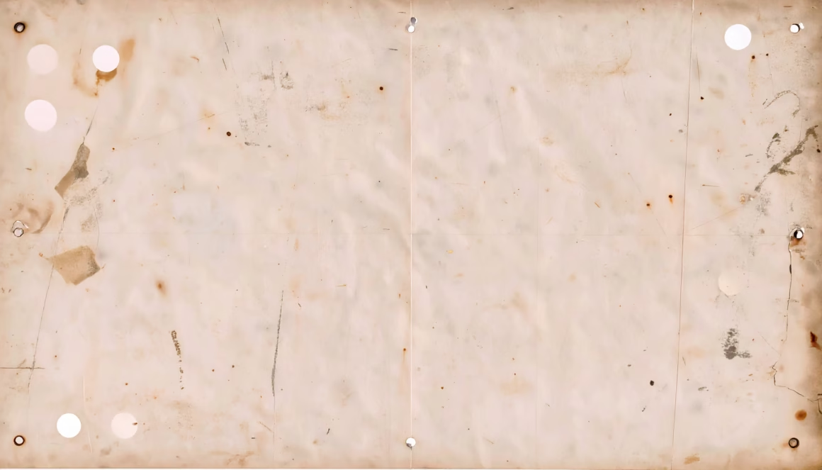
I’m not talking about some boring, flat beige color. I mean real, high-quality scans of paper that has lived a life—with all the cool water stains, soft fibers, and little creases that make something feel like it has a story.
Using these textures is a cheat code for making your work feel authentic, and a good pack of old paper textures is essential for any designer.
20+ Free Paper Textures Collection – Instantly Age Your Designs

And the best part? The old paper textures we’re hooking you up with are HUGE (like, more than 8000px + 300dpi), so you can use ’em for anything from an Instagram post to a giant printed poster without it looking blurry.
So, before you smash that download button, let’s chat about all the cool ways you can actually use these things to make your work unforgettable.
Making Stuff That Doesn’t Look Digital

This is the whole point, right? Here are some of my favorite ways to use these old paper textures to trick people into thinking I’m not just sitting at a computer all day.
For That Old-School Poster Vibe
You know those cool, vintage-looking posters you see everywhere? The secret isn’t some crazy complex filter. A lot of the time, it’s just a good design slapped on top of an old paper texture. It instantly gives it that authentic, printed-on-real-paper feel that a flat color just can’t touch.
If you’re making a flyer for a local coffee shop, for example, putting it on a slightly yellowed, creased paper background makes it feel warm and cozy instead of like a corporate ad.
Giving Your Photos That Nostalgic Feeling
This is one of my favorite tricks. You can take a brand new, sharp photo and make it look like you found it in your grandparents’ attic. Just toss one of these old paper textures on a layer above your picture in Photoshop and start messing with the Blending Modes.
My go-to’s are “Multiply” or “Overlay.” It creates this beautiful, aged effect, making it look like the photo was printed on textured paper decades ago.
Typography That Actually Has Character
Let’s face it, plain digital text is boring. But text with some grit and texture? That’s where it’s at. This is a go-to move for anyone designing logos or cool t-shirts. Just type out your words, then use a grainy old paper texture as a clipping mask.
Suddenly, your logo looks like it was made with real ink on handmade paper. It’s full of character, and it just feels more special.
For Wedding Invites That Don’t Look Cheap
If you’re designing anything that needs to feel elegant and personal—like wedding invitations—you basically have to use an old paper texture. It provides a soft, high-end feel that makes the whole thing look way more expensive than it is.
When you show a client a mockup on a beautiful, high-res parchment texture, they can really imagine what it will feel like in their hands.
For All My Fantasy Nerds and History Buffs
This is where these textures are the absolute MVP. Making a treasure map for your D&D campaign? Designing a prop for a historical film? Nothing screams “ancient artifact” like a weathered, stained paper background.
You can use a heavily torn and water-stained old paper texture as your base, draw your map on a new layer, and then use Photoshop’s burn and dodge tools to really make it look like it’s been through some stuff.
Making Digital Art Feel… Less Digital
If you’re a digital painter, you know the struggle. It’s hard to make your work not look like it was made on a screen. The secret? Start your next painting with a watercolor paper texture as your bottom layer.
As you paint on the layers above, that subtle texture will show through, making your work feel way more organic and traditional. It’s a game-changer.
My Go-To Tricks for Using These Textures

To get the absolute best results with your old paper textures, here are a few simple things I always do in Photoshop:
Get Weird with Blending Modes:
Seriously, don’t just drop the texture on and lower the opacity. That’s beginner stuff. The real magic is in the Blending Modes dropdown. My personal favorites are Multiply (makes everything look old and grungy), Overlay, and Soft Light (for when you just want a little something-something).
Just click through them and see what happens—you’ll find some happy accidents.
Adjustment Layers are Your Best Friend:
Want to make the paper look even older or change its color? Add a Hue/Saturation or Levels adjustment layer right above your texture and then “clip” it (right-click and choose “Create Clipping Mask”).
This way, your changes only affect the texture layer. You can make it darker, less colorful, whatever you want, without messing up the original texture.
Stack ‘Em Up!:
Who says you can only use one? Sometimes I’ll layer two or three different old paper textures on top of each other. I’ll use a big, stained one for the base, then add a smaller, creased one on top and use a layer mask to blend them together.
This way, you can create a totally unique texture that nobody else has.
Old Paper Textures Free Download Pack Details:
| Resource Type | Textures |
| Texture Variation | Paper Textures |
| File Format | High Quality JPGs |
| Resolution | 8064 x 4608px – 300 DPI |
| Password Protected | No |
| Cloud Source | Google Drive |
| Owner | Sajjad |
| File Size | 346.9 MB |
Frequently Asked Questions (FAQs)
Here are some quick answers to the most common questions about working with old paper textures.
Are these textures big enough to print on a poster?
Yep! That’s why high-resolution is so important. The ones we’re talking about are over 8000 pixels wide plus 300 DPI, so you can definitely use them for big print projects without them looking blurry or pixelated.
How do I actually get these into my project?
Super easy. Once you download and unzip the file, just open the texture you like in Photoshop. Then, just drag that texture’s layer from its own window over to the tab of the project you’re working on.
It’ll pop in as a new layer, ready for you to play with.
What’s the deal with parchment vs. vellum? Aren’t they all just old paper?
Good question! “Aged paper” is kinda the general term. But if you wanna get specific, “parchment” is usually that more yellowish, almost leathery-looking paper you see in old historical documents. “Vellum” is typically smoother and a little see-through, which gives it a fancier, more delicate vibe.
This pack includes a great variety of these old paper textures.
The free old paper textures you’ll find below are a fantastic starting point for any designer. They are high-quality, incredibly versatile, and ready to bring a timeless, authentic feel to your next project.
